Your church website is working around the clock, even when your office is closed. But if visitors land on it and can’t find service times, don’t know what to expect, or can’t figure out how to give, they leave. Knowing exactly which church website pages needed are in place can be the difference between a first-time visitor showing up on Sunday or never coming back. This guide walks you through every page that matters, why it matters, and what to put on it.
Table of Contents
- Key takeaways
- Church website pages needed: the core three
- Pages that build community involvement
- Communication and connection pages
- Sermon archive and online giving
- My take on simplicity vs. completeness
- Build your church website with Desadigit
- FAQ
Key takeaways
| Point | Details |
|---|---|
| Homepage clarity wins | Your homepage must answer who you are, when you meet, and where in under five seconds. |
| Visitor pages convert | A “Plan Your Visit” page is the highest-converting page for reaching first-time guests. |
| Community pages deepen roots | Events, small groups, and outreach pages move people from Sunday attendance to real belonging. |
| Sermon archives build SEO | Organized sermon content with transcripts improves your Google ranking and keeps members engaged. |
| Giving pages need compliance | Online giving pages must address donor privacy and fund designation to build trust and stay legal. |
Church website pages needed: the core three
Think of your website as a digital front door. The first three pages determine whether a visitor steps inside or walks away.
The homepage
A focused homepage should answer three questions the moment someone arrives: Who are you? When do you meet? Where are you located? You have roughly five seconds to communicate all three before a visitor loses interest. That means your homepage layout needs a clear headline, a short welcoming statement, service times, and a single prominent call to action.
The most effective call to action for outreach-focused churches is “Plan Your Visit.” Place it above the fold so no one has to scroll to find it. A short welcome video from your pastor on the homepage also works well to create an immediate human connection.
Pro Tip: Keep your homepage to one primary message. A cluttered homepage reduces engagement. Use white space generously and resist the urge to announce everything at once.
The about and beliefs page
This page does something no other page can. It tells your story. Visitors want to know your church’s history, your core beliefs, and what makes your community different before they walk through the door. Write it in plain, warm language. Avoid denominational jargon that outsiders won’t recognize.

Include your mission statement, a brief history, and a clear summary of your doctrinal beliefs. Photos of real congregation members make this page feel alive and trustworthy. Think of it as your church’s personality on paper.
Service times and location
This page sounds simple, but many churches get it wrong. List every worship service option with its time, location, and any relevant details like language or worship style. Include your full physical address, a Google Maps embed, parking instructions, and accessibility information for visitors with mobility needs.
If you have multiple campuses, give each one its own section. A visitor who can’t find parking details or doesn’t know if there’s an elevator may simply choose not to come.
Pages that build community involvement
Getting people through the door is step one. Keeping them connected is where these pages earn their place.
-
Events calendar. An up-to-date events calendar reflects an active, engaged church. It should include worship services, special events, holiday programs, and ministry meetings. A neglected or empty calendar signals inactivity to visitors, which is the opposite of what you want. Assign someone to update it weekly and remove past events promptly.
-
Small groups and connect page. Small group pages that explain purpose, meeting times, and sign-up options turn casual visitors into regular members. List each group with a short description, who it’s for, when it meets, and how to join. Make the sign-up process as simple as possible. A form that takes two minutes to fill out beats a phone call that requires three rounds of phone tag.
-
Outreach and volunteer opportunities. This page invites your congregation to live out their faith beyond Sunday. List local partnerships, mission trips, food pantry schedules, and any community service programs. Include a simple sign-up or contact option for each opportunity. When people feel they can contribute, they stay.
Pro Tip: Link your events calendar to your small groups and outreach pages. When someone signs up for a group or volunteers, they naturally discover other ways to get involved, which deepens their connection to the church.
Communication and connection pages
These pages reduce friction for first-time visitors and make it easy for anyone to reach your team.
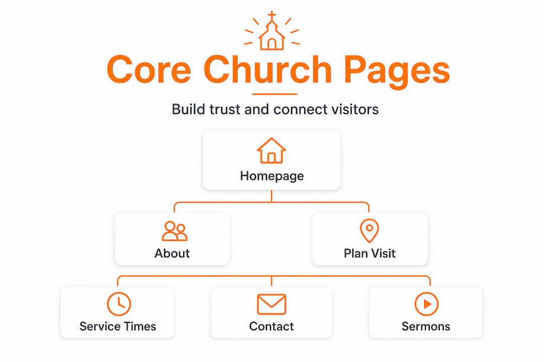
Contact page
Your contact page should include your phone number, email address, physical address, and office hours. Add a simple contact form so people can reach out without opening their email app. Keep the form short: name, email, message. That’s all you need.
A few things that make a contact page especially effective:
- A direct email address for specific departments like prayer requests or counseling referrals
- A note about response time so visitors know when to expect a reply
- A link to your social media profiles for people who prefer that channel
- Your church’s mailing address if it differs from your physical location
Staff directory
Introducing your team with photos and role descriptions humanizes your church online. People want to know who the pastor is, who leads the children’s ministry, and who to call about a specific need. A staff page with headshots, names, titles, and a short bio for each person builds familiarity before a visitor ever sets foot inside.
You don’t need to list every volunteer. Focus on paid staff and key ministry leaders. Even a small team of three or four people makes this page worthwhile.
Plan your visit page
This is the page that removes anxiety for first-time guests. A welcoming pastor video on this page significantly reduces visitor hesitation and increases attendance. Beyond the video, cover what to expect when they arrive, what people typically wear, where to park, where to drop off children, and what happens during a service.
The “Plan Your Visit” page is the highest-converting asset for outreach-focused churches. Treat it like a personal welcome letter. Answer every question a nervous first-timer might have, and do it in warm, plain language.
Sermon archive and online giving
These two pages serve your congregation long after Sunday ends.
Comparing sermon archive formats
| Format | Best for | SEO benefit |
|---|---|---|
| Video with transcript | All audiences | High |
| Audio with written summary | Bandwidth-limited users | Medium |
| Written sermon notes only | Study-focused members | Medium |
| Podcast feed | Commuters and mobile users | Low to medium |
Sermon archives organized by series, speaker, and date with transcripts improve both SEO and visitor engagement. When someone searches for a sermon topic your pastor covered, a well-organized archive gives Google something to index and gives visitors a reason to stay on your site longer. Transcripts also serve members with hearing impairments.
Pro Tip: Add a short written summary to every sermon post. Even 100 words describing the scripture reference and main point helps Google understand the content and helps members find what they are looking for.
Online giving page
Your giving page needs to do three things well: make giving easy, make it secure, and make it clear where the money goes. Online giving pages must include clear fund designation options and support recurring gifts to maximize contributions. Let donors choose between general fund, building fund, missions, or any other designated category your church uses.
Compliance with charitable solicitation laws is often overlooked but protects both donors and your church’s credibility. Include a privacy policy link on your giving page and make sure your payment processor is PCI-compliant. These details build the trust that encourages people to give repeatedly.
My take on simplicity vs. completeness
I’ve worked with enough church websites to say this plainly: the churches that try to put everything on their homepage are the ones whose visitors leave without doing anything. I’ve seen homepages with eight different announcements, three rotating banners, a live sermon feed, a calendar widget, and a donation button all competing for attention at once. Nobody knows where to look.
What actually works is restraint. Pick one thing you want a first-time visitor to do and make that the center of your homepage. Everything else gets its own page. That’s not minimalism for its own sake. It’s respect for your visitor’s attention.
The churches I’ve seen grow their online reach fastest are the ones who treat their website like a conversation, not a bulletin board. They tell a story on the About page. They answer real questions on the Plan Your Visit page. They keep their events calendar current. And they make giving feel safe and straightforward.
If your website currently has all the right pages but feels overwhelming, the fix isn’t adding more content. It’s editing what’s already there. Less text, more white space, one clear next step per page. That’s the formula that works.
— Matthew
Build your church website with Desadigit
If you’re ready to build or redesign your church’s website with all the right pages in place, Desadigit makes it straightforward and affordable. We specialize in church website design for congregations that want a professional, modern site without paying corporate agency prices.

Our church website packages include custom homepage layouts, sermon archive integration, online giving setup, events calendar, and a Plan Your Visit page built to convert first-time guests. We also offer ongoing website support so your site stays updated, secure, and working the way it should month after month. Whether you’re starting from scratch or improving what you already have, we’d love to help. See our church packages and find the right fit for your congregation.
FAQ
What pages does a church website need?
Every church website needs a homepage, an About/Beliefs page, service times and location, a contact page, and a Plan Your Visit page. Adding a sermon archive, events calendar, small groups page, and online giving page rounds out a complete site.
What should a church homepage include?
A church homepage should clearly state who you are, when and where you meet, and include a single call to action like “Plan Your Visit.” A focused homepage with minimal clutter and a welcoming message converts more first-time visitors than a busy, announcement-heavy layout.
Why is a “Plan Your Visit” page so important?
The Plan Your Visit page is the highest-converting page for outreach-focused churches because it directly addresses the anxiety first-time visitors feel. It should cover parking, childcare, dress code, and what to expect during a service.
How should a church organize its sermon archive?
Organize sermons by series, speaker, and date, and add a short written summary or full transcript to each post. This improves SEO and makes it easier for members to find specific messages.
Do church websites need a privacy policy for online giving?
Yes. Online giving pages must include a link to a privacy policy and use a PCI-compliant payment processor. Compliance with charitable solicitation regulations protects your donors and your church’s legal standing.