Your church website is working around the clock, even when your office is closed. But if visitors land on it and can’t find service times, don’t know what to expect, or can’t figure out how to connect, they leave. The right church website pages can make the difference between a first-time guest showing up on Sunday or moving on to another church.
Key takeaways
Your homepage should quickly answer who you are, when you meet, where you are, and what a visitor should do next.
A strong “Plan Your Visit” page helps first-time guests understand parking, childcare, dress, and what to expect.
Events, small groups, outreach, and volunteer pages help people move from attendance toward belonging.
Organized sermon content gives members a useful library and gives search engines more context about your ministry.
Make giving simple, secure, transparent, and easy to understand on both desktop and mobile.
Church websites become more effective when every page has a primary purpose instead of competing calls to action.
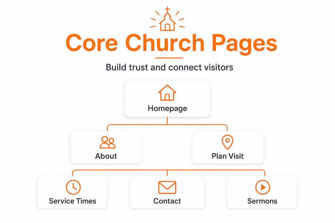
Church website pages needed: the core three
Think of your website as a digital front door. These first three pages do the most work in helping a visitor decide whether your church feels clear, welcoming, and worth visiting.
The homepage
A focused homepage should immediately answer three questions: Who are you? When do you meet? Where are you located? Add a short welcoming statement, service times, location information, and one primary call to action.
For outreach-focused churches, a strong primary CTA is often “Plan Your Visit.” Put it high on the page so a first-time guest doesn’t have to hunt for it.
The About and Beliefs page
This is where visitors learn your story. Explain your mission, your beliefs, your church’s background, and what makes your community distinct. Use plain, welcoming language and avoid assuming every visitor understands denominational vocabulary.

Real photos of your congregation, pastors, and ministry life can make this page feel far more personal than stock photography.
Service times and location
List each service time clearly, along with your physical address, parking guidance, accessibility information, and anything a guest should know before arriving. If you have multiple campuses, separate them clearly so visitors don’t have to guess which information applies to them.
Pages that build community involvement
Getting someone through the door is only the beginning. These pages help visitors and members understand how to participate in the life of the church.
- Events calendar. Keep upcoming services, ministry gatherings, holiday programs, and special events current. Remove expired events promptly so the website feels active and cared for.
- Small groups and connect page. Explain what each group is, who it serves, when it meets, and how to join. Keep the sign-up process simple.
- Outreach and volunteer opportunities. Show people where they can serve through local partnerships, ministry teams, missions, food programs, and other opportunities.
Communication and connection pages
These pages reduce friction and help visitors reach the right person without needing to search through the entire website.
Contact page
Include your phone number, email address, physical address, office hours, and a short contact form. A simple form with name, email, and message is often enough.
- Direct contact options for specific ministries when appropriate
- A realistic response-time expectation
- Links to your active social media channels
- Your mailing address if it differs from your physical location
Staff directory
Headshots, names, roles, and short biographies help humanize your church before a visitor arrives. Focus on pastors, staff, and key ministry leaders who visitors are most likely to contact.
Plan Your Visit page
This is where you remove uncertainty for a first-time guest. Explain where to park, what people typically wear, where children check in, what a service is like, and where to go when they arrive.
A short welcome video from a pastor or ministry leader can make this page feel much more personal and reassuring.
Sermon archive and online giving
These two areas continue serving people long after Sunday ends.
Comparing sermon archive formats
| Format | Best for | Search value |
|---|---|---|
| Video + transcript | Broadest audience | High |
| Audio + written summary | Mobile and lower-bandwidth visitors | Medium |
| Written sermon notes | Study-focused members | Medium |
| Podcast feed | Commuters and regular listeners | Low to medium |
Organize sermons by series, speaker, topic, and date when possible. Adding a short written summary or transcript helps both visitors and search engines understand what the message is about.
Online giving page
Your giving page should make giving simple, secure, and easy to understand. Use a reputable payment processor, explain fund options clearly, and include links to your privacy information and any other policies relevant to your church.
Make sure the giving experience works smoothly on mobile, because many donors will visit the page from a phone.
My take on simplicity vs. completeness
I’ve worked with enough church websites to say this plainly: the churches that try to put everything on their homepage are often the ones whose visitors leave without doing anything.
I’ve seen homepages with multiple announcements, rotating banners, sermon feeds, calendars, event promotions, and giving buttons all competing for attention. The problem isn’t that the information is bad. The problem is that nobody knows where to look first.
What works better is restraint. Decide what you most want a first-time visitor to do and make that action obvious. Everything else can live on a focused page of its own.
The strongest church websites feel more like a conversation than a bulletin board. They tell a story, answer real questions, make visiting less intimidating, keep events current, and make the next step obvious.
“Less clutter. More clarity. One clear next step per page.” — Matthew, Desa Digit
Build a better church website with Desa Digit
If your church website is outdated, difficult to navigate, or simply not helping visitors take the next step, Desa Digit can help you build a cleaner, more modern experience for your congregation and your community.
Our church website work can include a custom homepage, Plan Your Visit experience, sermon integration, events, giving, ministry pages, mobile optimization, and ongoing support.
Frequently asked questions
What pages does a church website need?
At minimum, a church website should include a homepage, About/Beliefs page, service times and location, contact page, and Plan Your Visit page. Sermons, events, groups, giving, staff, and ministries are common additions.
What should a church homepage include?
Clearly show who you are, when and where you meet, and the primary next step you want a visitor to take. For many churches, that next step is “Plan Your Visit.”
Why is a Plan Your Visit page so important?
It addresses the uncertainty first-time guests often feel by answering practical questions about parking, childcare, dress, accessibility, and what happens during a service.
How should a church organize its sermon archive?
Organize messages by series, speaker, and date, and add a written summary or transcript whenever practical. That helps both visitors and search engines understand the content.
What should a church include on an online giving page?
Use a secure giving platform, explain available funds clearly, make the process mobile-friendly, and link to relevant privacy and policy information.