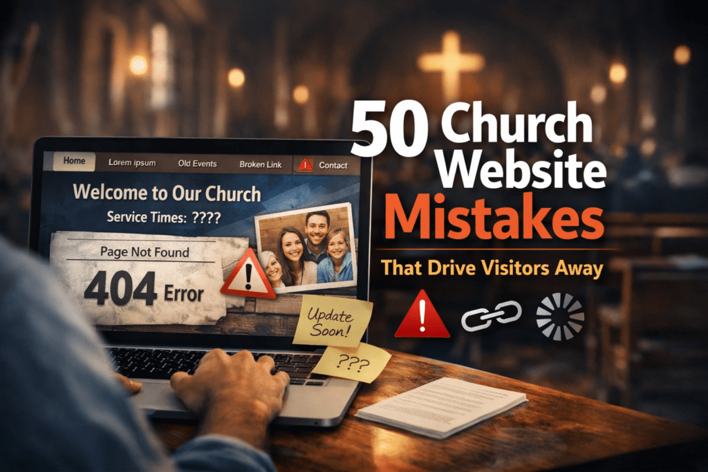
50 Church Website Mistakes That Drive Visitors Away
Discover the most common church website mistakes that hurt trust, weaken local SEO, and keep first-time visitors from taking the next step.
A church website is often the first impression someone gets before ever stepping into a Sunday service. Before people hear the preaching, meet the pastor, or experience the worship, they usually visit the website first. That means your website is not just a digital brochure. It is your church’s front door.
If your church website is confusing, outdated, slow, or hard to use, visitors often leave within seconds. They may never call, never plan a visit, and never come back. In many cases, it is not because the church lacks heart or biblical faithfulness. It is because the website unintentionally creates friction.
This guide covers 50 church website mistakes that drive visitors away, why they matter, and what your church can do instead. If your goal is to improve church website SEO, create a better first impression, and help more visitors feel ready to attend, these are the issues to fix first.
If your church needs help applying these improvements, see DesaDigit church website services, ongoing church website support, or church website SEO help.
Why Church Website Quality Matters
Many people visit a church website looking for quick answers before they ever attend in person. If those answers are missing or difficult to find, they often move on to another church.
- What time is service?
- What should I expect?
- What does this church believe?
- Is there a ministry for my kids?
- Where is the church located?
- How do I contact someone?
1. No Clear Service Times on the Homepage
One of the biggest church website mistakes is hiding service times. Visitors should not have to click through multiple pages to find when your church meets.
Why it drives visitors away: People are looking for quick answers. If they cannot find service times immediately, they may leave.
What to do instead: Place service times prominently near the top of the homepage and make sure they match your Google Business Profile.
2. No Church Address or Map
A website that does not clearly show where the church is located makes visiting harder than it should be.
Why it drives visitors away: Uncertainty creates hesitation.
What to do instead: Include your full address, an embedded map, and directions using tools people already know, such as Google Maps.
3. Missing Contact Information
If someone wants to ask a question, they should not have to hunt for a phone number or email.
Why it drives visitors away: It feels unwelcoming and unprofessional.
What to do instead: Add a clear contact page and place contact details in the header or footer.
4. An Outdated Website Design
An old-looking website can make people assume the church is inactive, disorganized, or disconnected.
Why it drives visitors away: Design communicates credibility before anyone reads a word.
What to do instead: Use a clean, modern, mobile-friendly design.
5. Slow Loading Speeds
If your site loads slowly, many visitors will leave before it fully appears.
Why it drives visitors away: People expect websites to load quickly.
What to do instead: Compress images, use quality hosting, and test your site with Google PageSpeed Insights and Core Web Vitals guidance from web.dev.
6. Poor Mobile Experience
Most people will first see your website on a phone, not a desktop.
Why it drives visitors away: If text is too small, buttons are hard to tap, or layouts break, users leave.
What to do instead: Make sure your site is fully mobile responsive and follows solid responsive design principles.
7. Too Much Text on the Homepage
A homepage packed with long paragraphs can overwhelm new visitors.
Why it drives visitors away: People scan before they read.
What to do instead: Use short sections, strong headings, and clear calls to action.
8. No “Plan Your Visit” Page
Visitors want to know what to expect before attending.
Why it drives visitors away: Without reassurance, many people feel nervous about visiting.
What to do instead: Create a page explaining service style, parking, kids ministry, dress, and what first-time guests can expect.
9. Confusing Navigation Menu
If your menu is cluttered or unclear, visitors feel lost.
Why it drives visitors away: Confusion kills engagement.
What to do instead: Keep navigation simple, clear, and organized.
10. Broken Links
Nothing makes a website feel neglected faster than links that do not work.
Why it drives visitors away: Broken links damage trust.
What to do instead: Audit your website regularly and fix all broken pages.
11. No Statement of Belief
People want to know what your church believes before they visit.
Why it drives visitors away: A missing beliefs page creates uncertainty.
What to do instead: Include a clear, accessible statement of faith.
12. Stock Photos That Feel Fake
Generic smiling group photos can make a church feel impersonal.
Why it drives visitors away: Authenticity matters.
What to do instead: Use real photos of your church, congregation, and ministry life.
13. No Photos of the Church Building
First-time visitors often want to know what the building looks like.
Why it drives visitors away: It adds uncertainty to the visit.
What to do instead: Show your entrance, parking area, sanctuary, and kids check-in area.
14. Hidden Sermons or No Sermon Archive
Many people want to hear preaching before attending.
Why it drives visitors away: If they cannot find sermons easily, they lose a key trust-building step.
What to do instead: Create a clear sermon page with recent messages and a visible watch/listen pathway.
15. Unclear Calls to Action
A website should guide people toward the next step.
Why it drives visitors away: If visitors do not know what to do next, they do nothing.
What to do instead: Use buttons like Plan Your Visit, Watch Sermons, Contact Us, and Give Online.
16. Outdated Event Information
Nothing frustrates users like seeing old announcements and expired events.
Why it drives visitors away: It makes the church seem inactive or careless.
What to do instead: Keep your event calendar current.
17. No Information About Children’s Ministry
Families often decide whether to visit based on children’s ministry details.
Why it drives visitors away: Parents want safety and clarity.
What to do instead: Explain check-in, age groups, volunteers, and safety policies.
18. No Information for New Visitors
Church members may know how everything works. Visitors do not.
Why it drives visitors away: Insider language creates distance.
What to do instead: Write with first-time guests in mind.
19. Using Church Jargon Everywhere
Terms like “fellowship hall,” “life groups,” or “ordination council” may be clear to insiders but not newcomers.
Why it drives visitors away: Visitors may feel like outsiders.
What to do instead: Use simple, welcoming language.
20. No Pastor Introduction
Visitors often want to know who leads the church.
Why it drives visitors away: Leadership matters for trust.
What to do instead: Include a warm pastor bio with a photo.
21. Hard-to-Read Fonts
Fancy or tiny fonts may look stylish but often hurt readability.
Why it drives visitors away: If people cannot read easily, they leave quickly.
What to do instead: Use clean, readable typography.
22. Poor Color Contrast
Text that blends into the background is frustrating.
Why it drives visitors away: Accessibility matters.
What to do instead: Use high contrast between text and background and follow recognized web accessibility standards.
23. Autoplay Audio or Video
Unexpected sound is one of the fastest ways to annoy users.
Why it drives visitors away: It feels intrusive.
What to do instead: Let users choose when to play media.
24. Cluttered Homepage Layout
Trying to show everything at once creates visual chaos.
Why it drives visitors away: Too much information makes people disengage.
What to do instead: Focus on the most important next steps.
25. No Online Giving Option
Many members and visitors expect a simple giving process.
Why it drives visitors away: A lack of convenience can reduce generosity.
What to do instead: Offer secure, easy online giving.
26. Online Giving Is Hard to Use
Even if giving exists, a clunky process discourages action.
Why it drives visitors away: People abandon complicated forms.
What to do instead: Use a simple and trustworthy giving system.
27. No SSL Security
If your website says “Not Secure,” trust drops immediately.
Why it drives visitors away: It feels unsafe.
What to do instead: Install an SSL certificate, use HTTPS sitewide, and follow guidance from providers like Let’s Encrypt or Cloudflare SSL/TLS.
28. No Clear Ministries Page
Visitors want to know how people connect beyond Sunday.
Why it drives visitors away: A missing ministries page makes the church feel hard to enter relationally.
What to do instead: List ministries clearly with short descriptions.
29. No Updated Staff or Leadership Page
Old staff listings confuse people and look neglected.
Why it drives visitors away: Inaccurate information undermines confidence.
What to do instead: Keep leadership pages current.
30. Missing FAQ Section
Visitors often have the same basic questions.
Why it drives visitors away: When answers are missing, anxiety grows.
What to do instead: Add an FAQ for first-time visitors and consider using FAQ schema markup where appropriate.
31. No Testimonials or Stories
Stories help visitors picture themselves in the life of your church.
Why it drives visitors away: Without human connection, the church can feel distant.
What to do instead: Share testimonies, stories of growth, and ministry impact.
32. Generic Messaging
If your website sounds like every other church, it becomes forgettable.
Why it drives visitors away: People connect with clarity and identity.
What to do instead: Communicate what makes your church distinct.
33. No Clear Mission Statement
Visitors want to know what drives your church.
Why it drives visitors away: Without direction, the church may feel vague.
What to do instead: State your mission simply and clearly.
34. No Visible Next Steps
Visitors need practical pathways.
Why it drives visitors away: Without next steps, curiosity does not turn into involvement.
What to do instead: Highlight steps like visit, connect, join a group, serve, or ask a question.
35. Poor Search Engine Optimization
A church website that is not optimized may barely appear in search results.
Why it drives visitors away: People may never find you in the first place.
What to do instead: Use relevant page titles, meta descriptions, headings, and follow the Google SEO Starter Guide.
36. Ignoring Local SEO
Many visitors search phrases like “church near me” or “Baptist church in Olympia.”
Why it drives visitors away: If your site does not target your location, you miss local traffic.
What to do instead: Use your city and region naturally throughout the site and support that visibility with tools like Google Search Console.
37. No Google Business Profile Integration
Many people find churches through Google Maps and local search.
Why it drives visitors away: A weak local presence makes the church harder to discover.
What to do instead: Keep your Google Business Profile updated and match it with your website details.
38. No Clear Denominational Identity
For some visitors, doctrinal or denominational clarity matters greatly.
Why it drives visitors away: Ambiguity can cause hesitation.
What to do instead: Explain your affiliation and theological identity clearly.
39. No Accessibility Consideration
Websites should serve all people, including those with disabilities.
Why it drives visitors away: A site that is hard to use excludes people unnecessarily.
What to do instead: Use accessible design, alt text, clear headings, readable formatting, and reference guidance from the W3C Web Accessibility Initiative.
40. Too Many Pop-Ups
Pop-ups can be useful, but too many feel pushy.
Why it drives visitors away: They interrupt the user experience.
What to do instead: Use pop-ups sparingly and only when helpful.
41. No Email Signup or Follow-Up Path
Some visitors are not ready to attend yet, but they are open to learning more.
Why it drives visitors away: Without a follow-up path, you lose warm interest.
What to do instead: Offer a newsletter or simple connection form.
42. No Social Proof
Visitors often look for signs that a church is active and alive.
Why it drives visitors away: A website without recent activity can feel stale.
What to do instead: Show recent sermons, events, photos, or ministry updates, and make sure your pages preview well on social platforms using Open Graph metadata.
43. Overdesigned Visual Effects
Too many animations and effects can distract from the mission.
Why it drives visitors away: Visitors want clarity more than spectacle.
What to do instead: Aim for beauty with simplicity.
44. No Fast Way to Watch Online
Some visitors want to watch a livestream before attending in person.
Why it drives visitors away: If online viewing is buried, you lose an easy trust-builder.
What to do instead: Add a clear Watch Online button and use a dependable video platform if your church streams regularly.
45. No Volunteer or Serving Information
Many people want to know how to get involved.
Why it drives visitors away: A lack of serving pathways can make the church feel closed off.
What to do instead: Create a serving page with clear opportunities.
46. Inconsistent Branding
Different colors, logos, fonts, and tones can make the site feel messy.
Why it drives visitors away: Consistency builds trust.
What to do instead: Use one cohesive visual identity across the site.
47. No Clear Homepage Headline
Your homepage should immediately tell people what kind of church this is and who it serves.
Why it drives visitors away: Vague headlines waste valuable attention.
What to do instead: Use a simple headline that explains your church clearly.
48. No Recent Content
A church website with no new sermons, news, or updates feels dormant.
Why it drives visitors away: People assume nothing is happening.
What to do instead: Post regular updates, sermons, blogs, or event highlights, then track performance in Google Analytics or Microsoft Clarity.
49. Treating the Website Like an Afterthought
Some churches build a site once and never think about it again.
Why it drives visitors away: A neglected site quietly communicates neglect.
What to do instead: Treat the website as an active ministry tool and review it regularly.
50. Forgetting That the Website Is for Outsiders Too
Many church websites are built mainly for current members.
Why it drives visitors away: A visitor-focused experience is often missing.
What to do instead: Build the website for both insiders and first-time guests.
Need Help Fixing These Church Website Mistakes?
If your church website feels outdated, confusing, or hard for visitors to trust, DesaDigit can help you improve the design, structure, SEO, and visitor experience.
Frequently Asked Questions
What is the biggest mistake most church websites make?
The biggest mistake is usually making basic visitor information hard to find. If service times, location, beliefs, contact information, or next steps are unclear, people often leave without taking action.
Why does church website SEO matter?
Church website SEO helps people find your church when they search for phrases like “church near me,” “Baptist church in [city],” or “Christian church with kids ministry.” Better SEO can increase visibility, traffic, and first-time visits.
How can I make a church website more welcoming?
Make service times visible, add a clear Plan Your Visit page, show real photos, explain what to expect, include children’s ministry details, and keep the overall design simple and easy to use.
What should every church website include?
Every church website should include service times, address, contact information, statement of beliefs, staff or pastor introduction, ministries, sermons, next steps, and a mobile-friendly design.
How often should a church website be updated?
A church website should be reviewed regularly and updated whenever service times, events, sermon content, ministry details, staff information, or visitor details change.
Helpful Resources and Official Tools
If your church wants to improve its website experience, visibility, speed, accessibility, and local presence, these official resources and widely trusted platforms can help.
Final Thoughts
A church website does not need to be flashy, expensive, or complicated to be effective. It needs to be clear, welcoming, trustworthy, and easy to use. The best church websites help people feel informed, confident, and invited before they ever walk through the doors.
If your church website is making several of these mistakes, do not feel discouraged. Most of them can be fixed with thoughtful updates. Even small improvements can make a major difference in helping visitors take the next step.
A good church website supports ministry. A poor one creates unnecessary barriers. In a world where many first encounters happen online, churches should make sure their digital front door is open, clear, and inviting.
Search Optimization Summary
This article is positioned to target churches searching for website usability, SEO, and visitor-conversion guidance.
SEO Title
50 Church Website Mistakes That Drive Visitors Away | Church Website Guide
Focus Keyword
church website mistakes
Meta Description
Discover 50 church website mistakes that drive visitors away and learn how to fix them so your church website becomes clearer, more welcoming, and more effective for first-time guests.
Search Intent
Informational SEO content aimed at church leaders, pastors, ministry teams, and organizations evaluating how to improve website trust, usability, local discoverability, and first-time visitor experience.